

Responsive Web Design for a Local Animal Shelter

Background
As one of the most prominent dog shelters in the UAE, K9's aim is to find homes for all dogs. Their website is in need of a redesign to support their mission better and offer a better user experience. The shelter’s core existence relies mainly on donations, and volunteer programs, so it is essential that their website provides clear options in terms of how to get involved.
The Challenge
Addressing Pet Adoption in Transient Cities
Addressing Pet Adoption in Transient Cities
The project came with its unique set of challenges mainly because of the transient nature of Dubai. Because of the fact that around 90% of the residents are expats, from different countries and cultures, there was a lack of awareness and commitment when it came to pet adoption. Dog owners also often left their dog behind when leaving the country because taking the dog would be tricky logistically and financially. This resulted in a massive number of stray and abandoned dogs which the shelter had to deal with constantly.

Research
The State of Abandoned and Stray Dogs in Dubai
The State of Abandoned and Stray Dogs in Dubai
“You can tell how the market is doing based on how many dogs [the shelter] is taking on" Alister Milne

Interviews with pet owners were instrumental in order to get a better feel of their approach to pet adoption and to tackle the users' mental model when it comes to choosing the right pets for them. These interviews revealed the following key insights:
- There was a tendency to shop instead of adopt in spite of the staggering numbers of abandoned pets.
- There was a general lack of education and commitment when adopting a new pet.
- There was a general lack of education and commitment when adopting a new pet.
Meet Sara
I used the findings from the user interviews to construct a persona, in order to really put myself in the user's shoes and address her needs, goals and pains throughout the design process...

User Persona for K9 Friends
Exploring Design Opportunities
Interviewing the stakeholders at K9 revealed instrumental insights in terms of how their goals are best achieved via their website, what are the most important features, and what services should or should not be executed online via the platform. I started to consider these business goals along with the user needs that I had established from user research:

Tackling the "Sweet Spot" of UX
Define
Adopt Don't Shop!
Adopt Don't Shop!
As a result of aggregating both the shelter's goals and user needs, It was clear that K9 needed to be the "Middleman" between those who are looking to adopt, and those who are abandoning their dogs, while simulating a shopping-like experience and ensuring new dog owners knew what they were getting into.
Accordingly, the following key sections needed to take place on the new platform, and ended formulating the main site navigation:
1 - Adopt Section: Addressing the tendency to shop instead of adopt, with search, filters, and pet profiles pages.
2 - Rehome Section: Enabling current dog owners to match their dogs with new owners via the website.
3 - Volunteer Section: One of the stakeholders' priorities to get people involved and donate their money/time.
4 - Be Prepared Section: Ensuring new dog owners know what they are signing up for, in response to user research which showed this to be one of the contributing factors to abandoned dogs.

Establishing the Hierarchy
Since one of the goals were revamping the information architecture, a card sorting exercise was necessary in order to tackle the taxonomy of the site and get a sense of how users would categorize different site topics. Then, through synthesizing the findings from the card sorting, and taking into consideration research insights, I created the new site map...

The New Site Map for K9 Friends
Designing the Interaction
Because of the difference in nature between the "Adopt" and the "Rehoming" features, the user flows needed to be designed differently, according to the different tasks for each feature. Designing these user flows were the first stepping stone to the wireframing phase...

User flows for the "Rehoming" and "Adoption" Features
Ideation
Wire-framing it
Wire-framing it
The next step was to flesh out the main content area for the responsive wireframes for desktop, tablet and mobile. Working off of a 12-column grid, I visualized the layouts of the website, with a content strategy the corresponds with research insights, and builds upon the new information architecture...

Low-Fidelity Responsive Wireframes
Designing the Interface
The color palettes of the new K9 platform needed to provoke warmth, trust, and playfulness, which is why I settled on a reddish shades of purple. Combining them with a pink accent color, it achieved the goal of bringing personality with a hint of flair to the site. UI components also engaged users with an energetic and welcoming feel that would lead them to finishing their tasks...
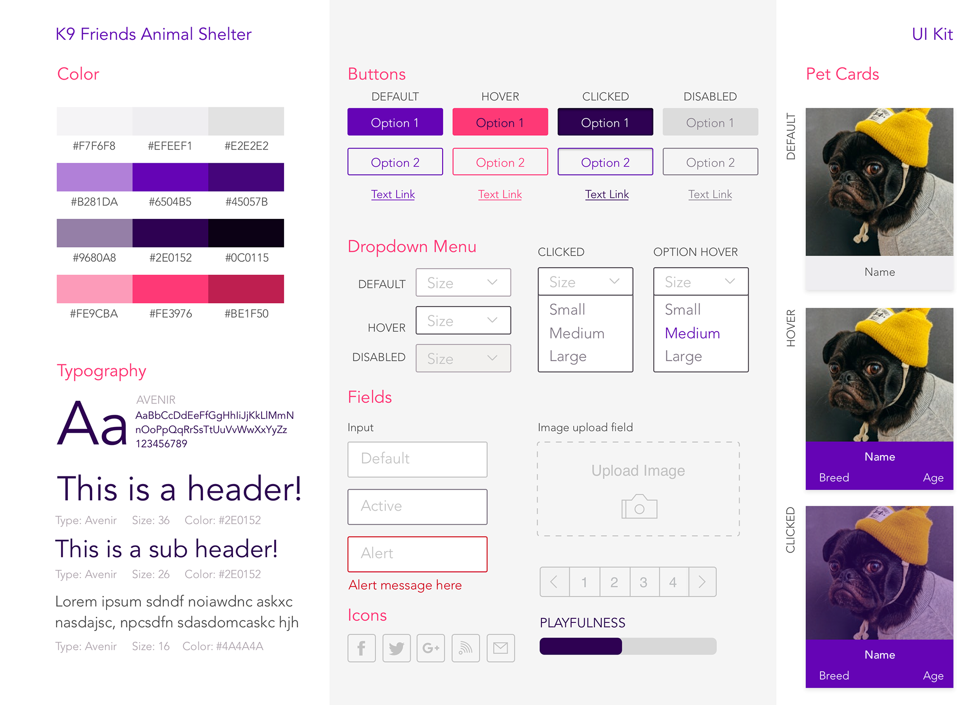
Designing the UI Kit for the New Platform
The next step was to flesh out the pages of the website in order to start setting up the mid-fidelity prototype, and prepare for the usability testing to validate design...

Mid-Fidelity Prototype of K9 Friends
Validate
Putting It to the Test!
Putting It to the Test!
Utilizing the Invision mid-fidelity prototype, usability testing was due in order to observe how would users go about tackling key tasks on the new platform. The testing revealed interesting insights in terms of how could the design be improved, like the need to add additional images to each pet profile, and the need to clarify what would "Getting involved" at K9 entails.

Final Thoughts
Thinking about pet adoption in light of a very unique context came with its own set of challenges, which proved how there are always opportunities once the data is gathered and considered critically. This project has taught me to strive to always look at the bigger picture and not just the problem at hand.


